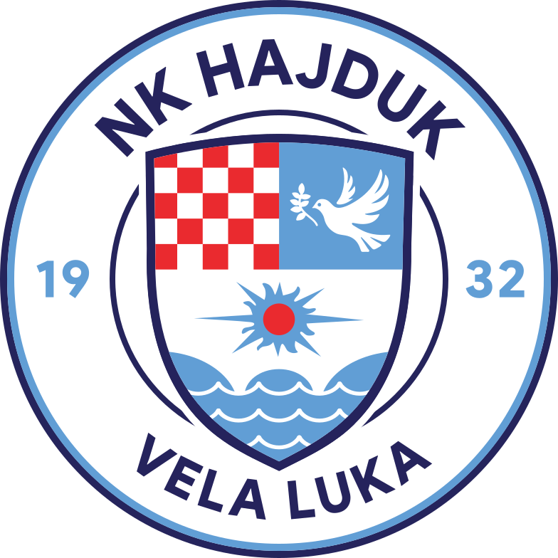
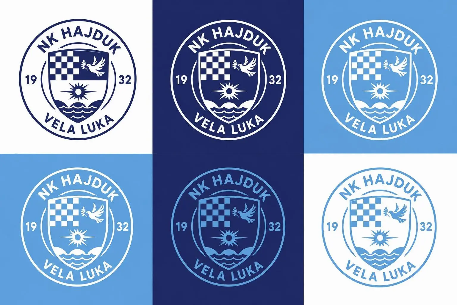
VELA LUKA, 11 June 2026. — On the opening day of the Football Summer, a proposal for a new visual identity of NK Hajduk Vela Luka was presented at the pitch, seeking to unite the club's rich tradition with the demands of modern sports branding. It is the result of a detailed analysis and development prepared over the winter period.
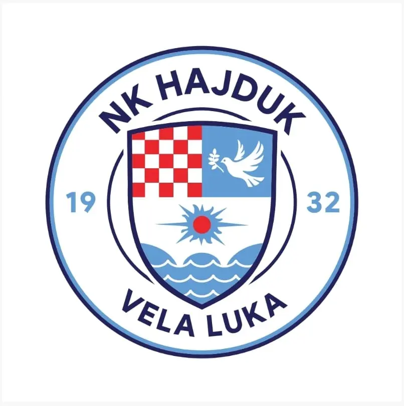
The new solution is based on a circular shape that brings together the historic club shield and all of its recognisable symbols, with an emphasis on better functionality, clarity and applicability across modern media.
The aim is not to change the club's identity, but to further strengthen it and adapt it to today's communication standards.
The authors of the proposal
The new badge retains all the key elements that have represented NK Hajduk Vela Luka for decades:
the Croatian chequerboard,
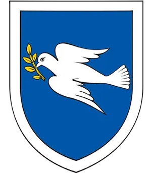
the white dove with an olive branch,
the sun and the sea waves,
the historic shape of the shield,
the year of founding 1932 together with the name of the club and the town.
A return to the roots
One of the main arguments for the new solution lies precisely in the club's history. The oldest known crest of NK Hajduk Vela Luka, from 1932, was circular in shape, and later versions also frequently used a circular composition as the basis of their visual identity.
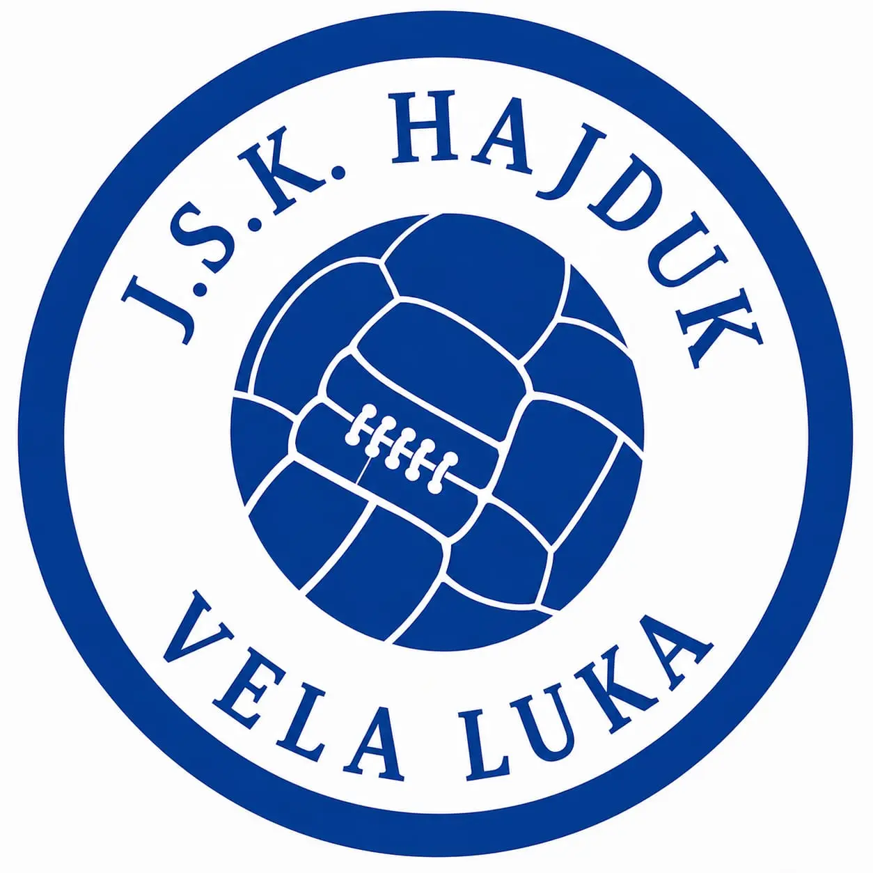
The proposed badge therefore represents a kind of return to its original roots, while at the same time connecting the club's oldest symbols with the historic shield used for decades. This achieves continuity between the club's past and its future.
Advantages over the current crest
The document states that the current pentagonal version represents an important step in the modernization of the club's visual identity. However, the pentagonal shield visually competes with the historic crest—the shield at the center—pushing it into the background. In addition, it is less adaptable to modern media.
In the circular version, the crest is relatively larger, occupying approximately 20% more space in relation to the overall logo than it does in the pentagonal version.
In other words, if the goal is to make the central crest as prominent and dominant as possible, the circular logo gives the crest greater visual emphasis.
The club's name occupies a prominent position, the historic shield takes center stage, and the founding year further balances the overall composition.
Adapted to modern football
Particular emphasis was placed on the functionality and scalability of the badge. The proposed crest is designed to work equally effectively across a range of surfaces:
mobile devices and social media,
television graphics and official apps,
kits, supporter merchandise and promotional materials.
The outer circular frame serves both as a classic football form and as a protective element that directs the eye towards the historic shield and ensures good visibility of every detail even at very small display sizes. Unlike previous solutions, each element has its own clear function within the whole.
More than an aesthetic change
The authors of the proposal stress that this is not merely a visual refresh, but a response to the challenges of the modern sporting environment. Today's club badge must be just as recognisable on a smartphone screen as it is at the stadium, on a television broadcast or on a supporter's scarf.
By retaining all of the historic symbols, returning to the circular format of the club's earliest years and introducing a clearer and more functional structure, the proposed solution aims to ensure the long-term recognisability and sustainability of the club's identity. The authors believe this is the most complete and most promising solution for the future of NK Hajduk 1932 Vela Luka — an identity that is at once traditional and modern.
Read more about the club's symbols and values on the Identity page.
#cilalukazahajduka